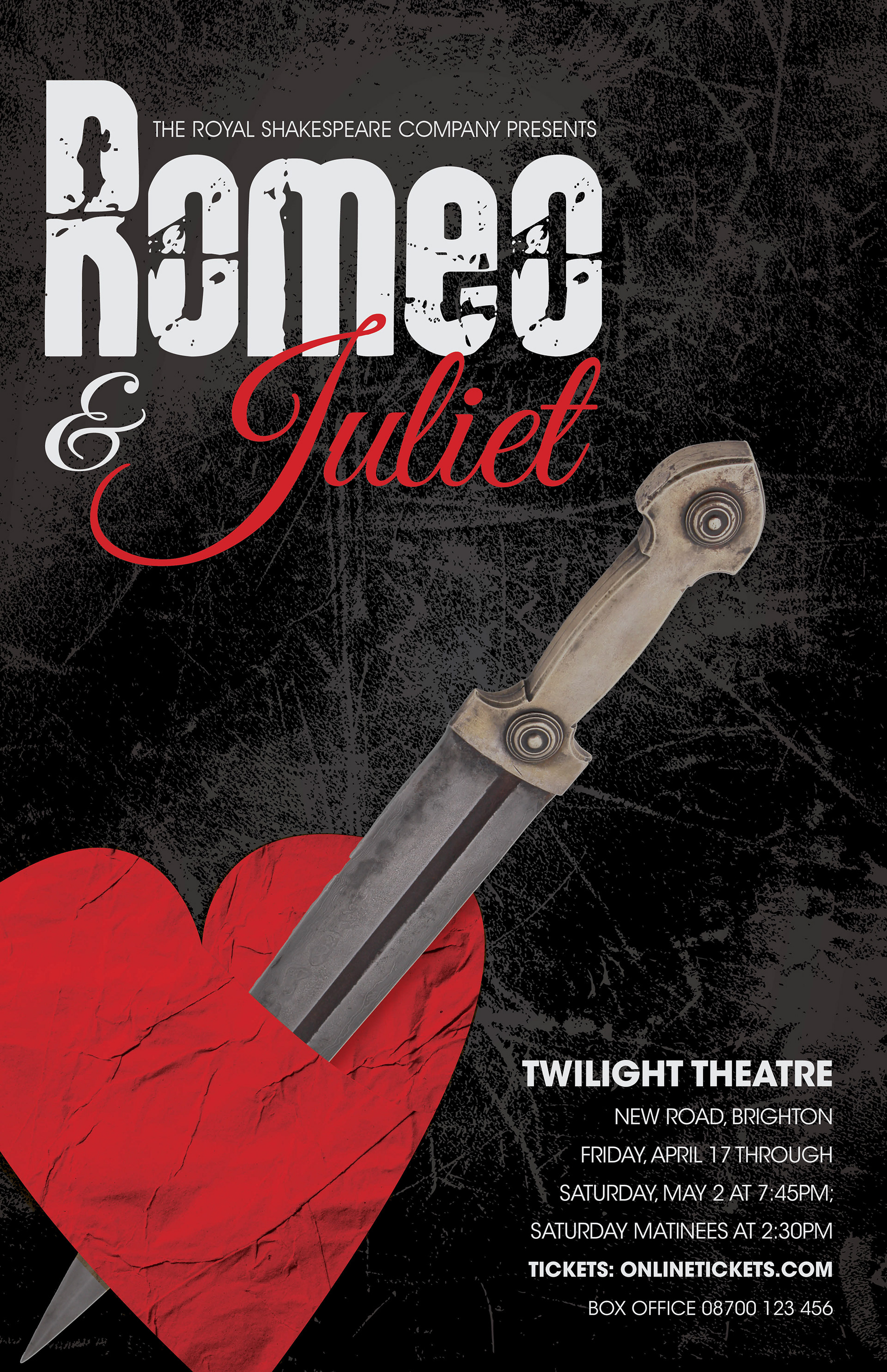
Final Poster design. Utilizes textures and contrasting colors to create a dramatic feel. A grunge font was used for Romeo's name and a flowing script for Juliet's name to show the contrast between the two.

Sketches leading up to the final poster. The sketches played off of key areas of the Shakespeare play incorporating in a rose or dagger. The last sketch was a type based poster. The dagger was decided to be incorporated into the final for its ability to draw the eye down the page when placed correctly.

Bus stop poster mock up.