
This is the final logo design that was produced from the merger of two technical colleges. The logo features a sphere that is made up of 7 stripes. The three green stripes represent the 3 counties that one of the colleges covered and the 4 blue represent the 4 counties that the other college covered pre merger. After the merger the stripes come together to form the sphere and a new college as a whole.
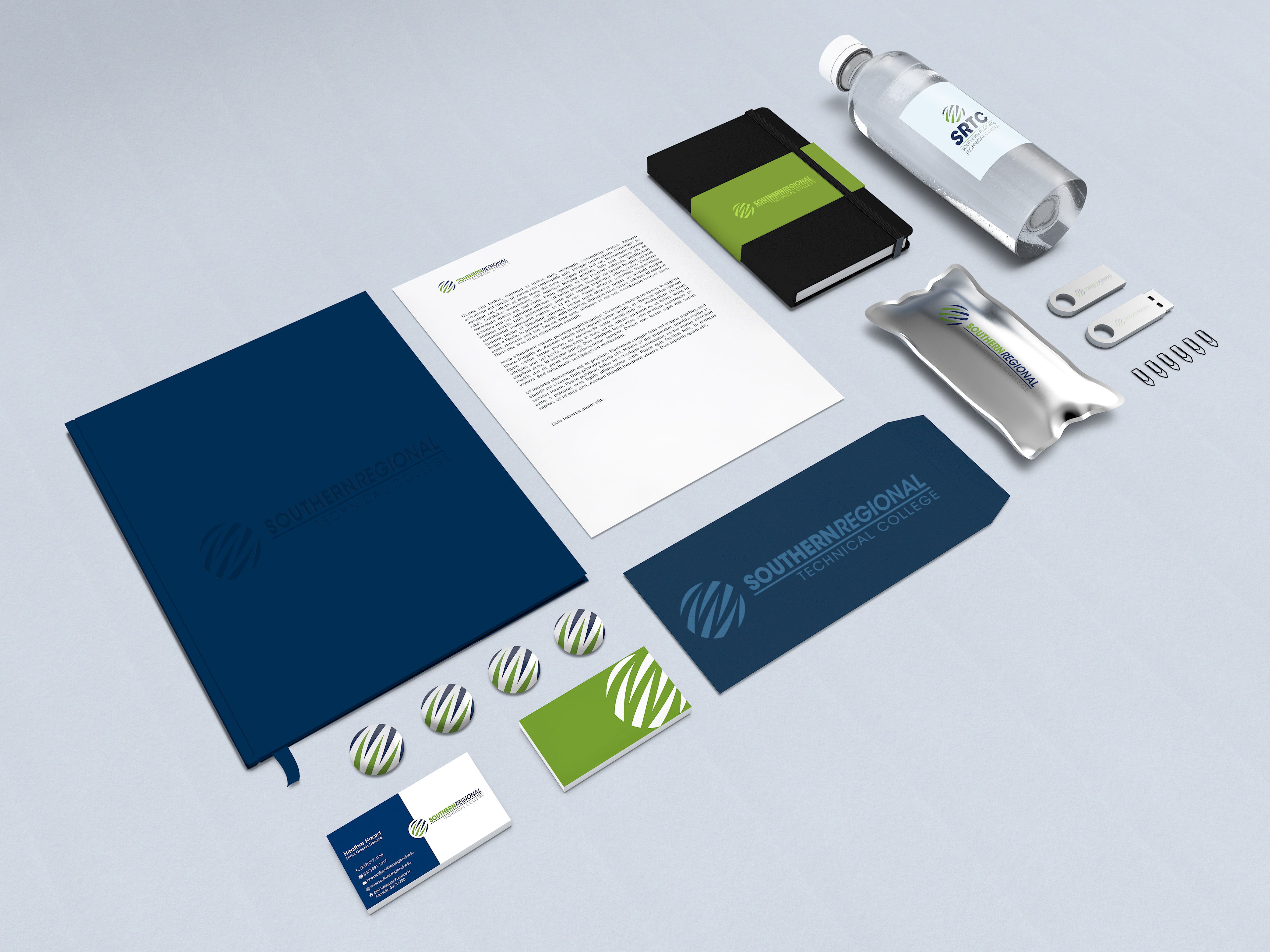
The above images features various uses of the logo as well as the SRTC business card design and the alternative logo for vertical use. The logo was used on promotional items like water bottles, fashion buttons, folders, flash drives and sketch book covers.